Vote By Mail (Hawkfish)
The Problem
In an election year estimated to result in an unprecedented number of voters mailing in their ballots, many for the very first time, the need to ensure a proper understanding of the process, as well as to engender trust in the vote-by-mail system, was of chief concern if voter turnout was to maintain a healthy level.
A known brand identity’s seal of approval was one way to engender that trust, offering assurances that guidelines would be made clear, and that the system would function properly for users in any number of living situations made prevalent by the continuing COVID-19 pandemic.
In this, Hawkfish saw an opportunity to provide political organizations across the country with a white label product to help their followers streamline the vote-by-mail process with confidence.
The Research
Existing services were standalone products that had some combination of white-labeling ability, integration with all 50 states, language accessibility, and ease of use, though no single service featured them all.
In addition, each seemed to employ an “if you build it, they will come” approach, missing a way to funnel users to a point of entry.
As a solve, targeted ads with trusted partner organization branding could link to the service, which could itself be similarly branded.
With regard to process, the requirements for obtaining a vote-by-mail ballot varied not just from state to state, but sometimes county to county. Even a single zip code did not guarantee a single set of registration requirements.
Another consideration was the sudden high volume of flight from urban areas due to the pandemic, as many voters would have to ensure that their ballots would be sent to their new/temporary mailing addresses and not their registered addresses, or be reminded to do so.
Each case represented a unique user flow, with different junctures for potential human error, so clarity on what to do in any given step would be essential for trust in the process to be preserved.
The Team
As the lead UI & interaction designer, and key UX designer under the Director of UX, my role on this project was to:
Create a design system and core components for the product.
Build & iterate on interactive prototypes for user testing.
Mock up high fidelity mobile & desktop screens and interaction videos as a proof of concept for senior leadership to approve before developing for potential clients.
The Design Direction
As putting one’s vote into the hands of a non-governmental third-party entity required enormous trust, the design had to be clear, polished, and accessible, in a way that was friendly without being cute.
There would be a single “default” skin of the product, to be customized using the client partner’s logo, brand fonts, and color palette, where applicable.
As the meat of the product would be the gathering of user data, reusable components for those steps were worked out first, passing through several iterations.
Once the design system was sufficiently refined, the core components and style guide were were handed off to the development team.
Responding to internal reviews and user feedback, the launch screen went through a number of design passes before the right combination of clarity, visual interest, and formality, was established.
As many states required a photo ID to fulfill registration requirements, the product would need to access the user’s camera to take a picture of his/her ID, or offer an option to upload an existing picture of the ID.
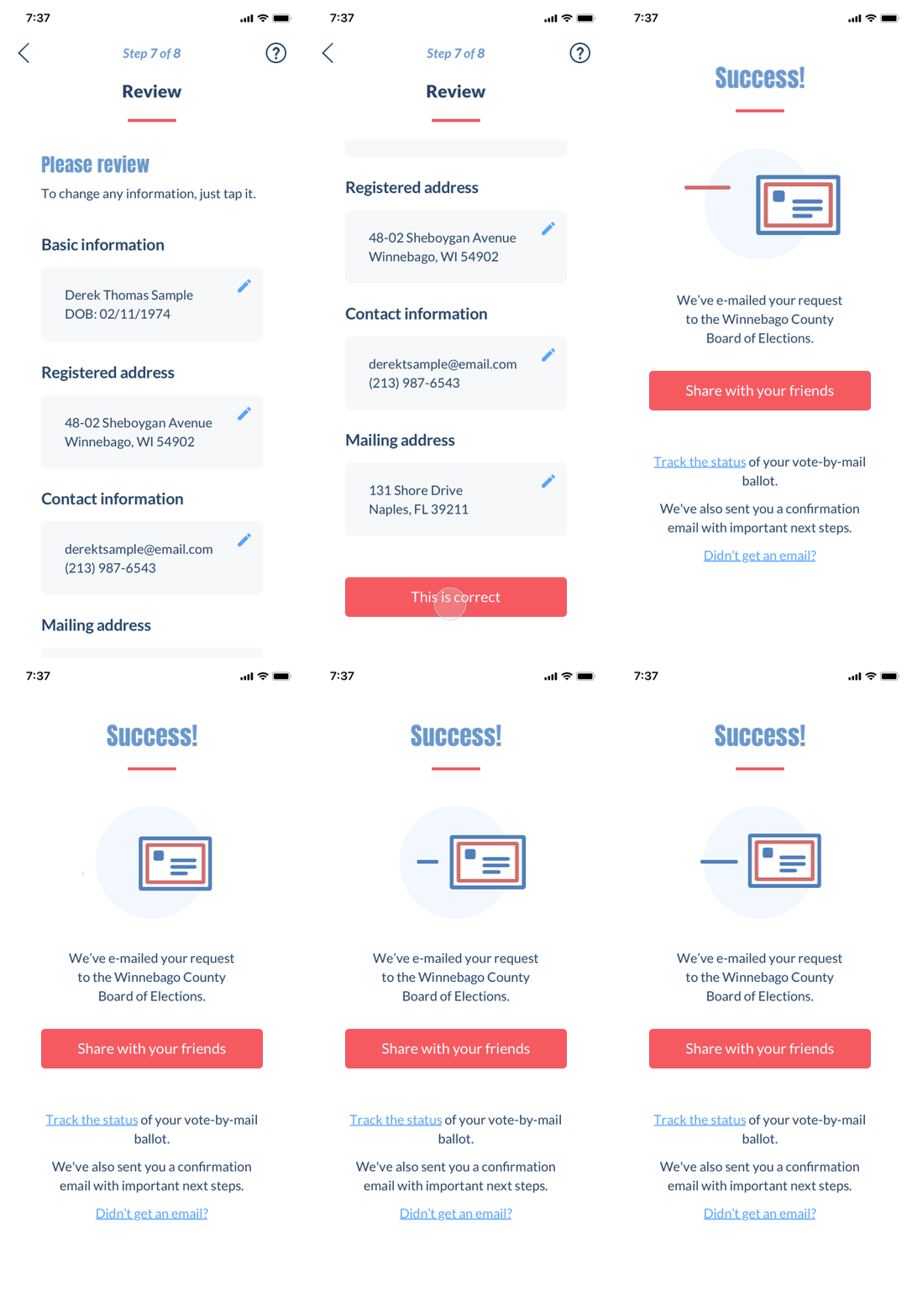
After completing the final step (a variable, dependent on where the user was registered to vote), the user would receive confirmation, a link to track registration status, and the option to share the experience (and thus nudge friends to register).
A share button would reveal a thumbnail of the share image with links to the user’s various social media platforms.
Pausing Development
As I was in the process of leveraging my mobile designs for desktop, senior leadership announced the decision to pause development.
The product’s primary potential client had chosen to fund a similar product with an agency they’d had a prior relationship with, and at the same time, the need for developer resources had become more urgent for other ongoing projects.
However, the partially completed web app, as well as existing interactive prototypes, would serve as collateral for the sales team to pitch the organization’s product development capabilities.


